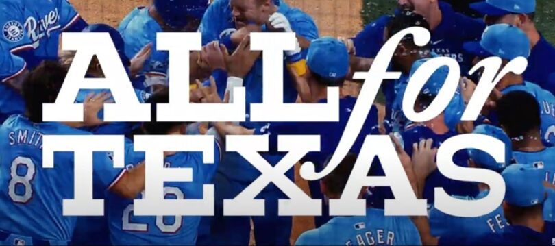
The Texas Rangers sent me a survey this week about the team’s “brand.” They want my opinions and, I assume the opinions of thousands of other Rangers fans, on logos and taglines, uniforms and colors, how much baseball I watch, how often I go to the ballpark, and what I like and don’t like about how the Rangers are marketed, promoted, and otherwise presented to the public.
It took about 15-minutes to fill out the survey and it was a lot of fun on several levels. It was interesting to see what they’re asking and how they’re asking it. It seems the Rangers know they’re competing with the Mavericks and Stars for sports fans’ loyalty and entertainment dollars, but they don’t see themselves in any kind of competition with the Cowboys–they know the football team is its own thing. The Rangers appear to be interested in my thoughts on everything from the mascot, Rangers Captain (not a fan), to the new Rangers Sports Network (love it). It was soul-cleansing to tell the Rangers that I despise the City Connect uniforms (they asked!) and more than a little satisfying to correctly answer a couple of trivia questions that only hard-core Rangers fans would know.
The most difficult part of the survey was ranking all their uniform colors and designs. I love the 1970s red “Rangers” script across a clean white jersey, but that current red and white “TEXAS” across the navy top also looks pretty sweet.
The quickest and most fun part of the survey was ranking all seven of the Rangers historic team logos in order from my favorite to my least favorite. This is easy because my feelings about this are strong and have not changed. Here are the seven in my order of preference:
![]() 1. The OG 1972 cowboy hat logo with the old west letters. This was the first Rangers logo we saw when the team moved to Arlington in 1972. This was the Rangers sticker I put on my lunchbox and the bumper sticker I put on my bedroom mirror when I was seven or eight years old. This was the logo on the front of my Dr Pepper Junior Rangers Club membership package I got from Tom Thumb. It’s a classic. And by far my favorite Rangers logo.
1. The OG 1972 cowboy hat logo with the old west letters. This was the first Rangers logo we saw when the team moved to Arlington in 1972. This was the Rangers sticker I put on my lunchbox and the bumper sticker I put on my bedroom mirror when I was seven or eight years old. This was the logo on the front of my Dr Pepper Junior Rangers Club membership package I got from Tom Thumb. It’s a classic. And by far my favorite Rangers logo.
![]() 2. The Montreal Expos ripoff logo. The team employed this logo during most of the 2000s, including during their first trips to the World Series in 2010 and 2011 and their World Series title in 2023. They unveiled this logo while I was working for and with the Rangers at KRLD in 2003, and officially retired it after the ’23 season. It’s clean, it’s neat, it’s the one they used the longest, and it’s connected to the Rangers’ most successful seasons. This is the logo I have in at least six places in and on my truck. It’s not technically baseball correct in that the ball on the logo has blue stitches. But I really love it.
2. The Montreal Expos ripoff logo. The team employed this logo during most of the 2000s, including during their first trips to the World Series in 2010 and 2011 and their World Series title in 2023. They unveiled this logo while I was working for and with the Rangers at KRLD in 2003, and officially retired it after the ’23 season. It’s clean, it’s neat, it’s the one they used the longest, and it’s connected to the Rangers’ most successful seasons. This is the logo I have in at least six places in and on my truck. It’s not technically baseball correct in that the ball on the logo has blue stitches. But I really love it.
![]() 3. The ’80s State of Texas logo. This one is highly nostalgic for me as it reminds me of Rangers games at Arlington Stadium and the players I watched there. This logo is old Charlie Hough and brand new Ruben Sierra and Juan Gonzales. This is “V-Ball,” unconventional and charismatic manager Bobby Valentine. This logo is Oddibe McDowell, Larry Parrish, Mitch Williams, and Julio Franco. This is the logo Nolan Ryan wore when he pitched his sixth and seventh no hitters and when he struck out Ricky Henderson for his 5,000th K. More than that, this is the logo they were wearing when I really fell in love with baseball and the Rangers. I had a drivers license, we could sit in the aluminum outfield bleachers for five dollars, and we went all the time. All the time. This is the Rangers logo when I took my brother Keith to all those games during my summers home from college. This is the logo when I took Carrie-Anne to games when we were dating, including a memorable July 4th Rangers game in 1989. The more I think about it, maybe I should have ranked this one at number two.
3. The ’80s State of Texas logo. This one is highly nostalgic for me as it reminds me of Rangers games at Arlington Stadium and the players I watched there. This logo is old Charlie Hough and brand new Ruben Sierra and Juan Gonzales. This is “V-Ball,” unconventional and charismatic manager Bobby Valentine. This logo is Oddibe McDowell, Larry Parrish, Mitch Williams, and Julio Franco. This is the logo Nolan Ryan wore when he pitched his sixth and seventh no hitters and when he struck out Ricky Henderson for his 5,000th K. More than that, this is the logo they were wearing when I really fell in love with baseball and the Rangers. I had a drivers license, we could sit in the aluminum outfield bleachers for five dollars, and we went all the time. All the time. This is the Rangers logo when I took my brother Keith to all those games during my summers home from college. This is the logo when I took Carrie-Anne to games when we were dating, including a memorable July 4th Rangers game in 1989. The more I think about it, maybe I should have ranked this one at number two.
![]() 4. The current “T” logo. I like the design of the “T.” I like the simple strength it communicates. It falls very much in line with the traditional “letter” on a baseball cap. But I’m not sure I’m wild about it being the main logo that’s used for everything. It’s enough for the cap that tops off the whole uniform; I don’t think it’s enough to represent the Rangers on everything. If you want to brand the Rangers with that “T,” you need something else with it. It looks very similar to the T-Mobile logo, but not nearly as nationally recognized. It’s not like the Yankees’ or the Dodgers’ interlocking letters; it’s not iconic. I don’t think too many people outside Texas know that “T” as the Rangers. But of all the things they’ve put on their cap, this current “T” is the best.
4. The current “T” logo. I like the design of the “T.” I like the simple strength it communicates. It falls very much in line with the traditional “letter” on a baseball cap. But I’m not sure I’m wild about it being the main logo that’s used for everything. It’s enough for the cap that tops off the whole uniform; I don’t think it’s enough to represent the Rangers on everything. If you want to brand the Rangers with that “T,” you need something else with it. It looks very similar to the T-Mobile logo, but not nearly as nationally recognized. It’s not like the Yankees’ or the Dodgers’ interlocking letters; it’s not iconic. I don’t think too many people outside Texas know that “T” as the Rangers. But of all the things they’ve put on their cap, this current “T” is the best.
![]() 5. The badge logo. It’s the only logo in Rangers history, besides the aforementioned “T” which should only be on a cap, that has no baseball or anything representing baseball tradition in it. It’s an historic Texas Rangers badge outline and a generic font over the banner they use in the Overhead Door logo. It’s an evolution of the All-Star Game logo MLB used when Arlington hosted the Midsummer Classic in 1995. And it’s too busy. It looks like something an 8th grader would draw.
5. The badge logo. It’s the only logo in Rangers history, besides the aforementioned “T” which should only be on a cap, that has no baseball or anything representing baseball tradition in it. It’s an historic Texas Rangers badge outline and a generic font over the banner they use in the Overhead Door logo. It’s an evolution of the All-Star Game logo MLB used when Arlington hosted the Midsummer Classic in 1995. And it’s too busy. It looks like something an 8th grader would draw.
![]() 6. The diamond logo. This is the logo the Rangers unveiled when they opened The Ballpark in Arlington in 1994, so in my mind it’s mostly associated with the red uniforms and caps, which they also wore for the first time in history during that era. This logo goes with the first Rangers team to win a division championship in 1996, so it belongs in my heart with Johnny Oates and Pudge Rodriguez, Rafael and Juando, Ken Hill and John Burkett, Will Clark and Rusty Greer. It’s not very imaginative at all. Boring. The bold and exciting part of this era was the beautiful new ballpark and the red unis.
6. The diamond logo. This is the logo the Rangers unveiled when they opened The Ballpark in Arlington in 1994, so in my mind it’s mostly associated with the red uniforms and caps, which they also wore for the first time in history during that era. This logo goes with the first Rangers team to win a division championship in 1996, so it belongs in my heart with Johnny Oates and Pudge Rodriguez, Rafael and Juando, Ken Hill and John Burkett, Will Clark and Rusty Greer. It’s not very imaginative at all. Boring. The bold and exciting part of this era was the beautiful new ballpark and the red unis.
![]() 7. The weird “TR” thing. The best thing about this strange faddish logo is that it only lasted two seasons, 1982-83. During those two years, the Rangers finished a combined 51 games out of first place. Good riddance. They fixed it in 1984 by designing another state of Texas logo that spelled out more directly what “TR” couldn’t quite accomplish. I cringe when I see this horrible logo. Even if the Rangers survey had included the City Connect panther or that weird City Connect “TX” with the spur in the survey, I still would have ranked this “TR” thing dead last.
7. The weird “TR” thing. The best thing about this strange faddish logo is that it only lasted two seasons, 1982-83. During those two years, the Rangers finished a combined 51 games out of first place. Good riddance. They fixed it in 1984 by designing another state of Texas logo that spelled out more directly what “TR” couldn’t quite accomplish. I cringe when I see this horrible logo. Even if the Rangers survey had included the City Connect panther or that weird City Connect “TX” with the spur in the survey, I still would have ranked this “TR” thing dead last.
I’d love to get your opinions on these seven logos. Click on comments at the top of this post and rank yours in order. The way the team has played the past couple of weeks, this is about the most interesting Rangers thing going.
~~~~~~~~~~~~~~~~~~~~~~~~~~~
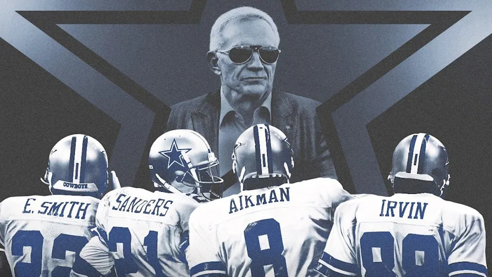
Netflix’s Team, the Dallas Cowboys, are in prime time with today’s drop of the much-anticipated series, “America’s Team: The Gambler and his Cowboys.” All eight episodes have been released today, but I am only going to watch one at a time. No matter how much I’d love to binge this thing all night tonight, I’m only going to watch one per day. I want the proper time to process. To soak in it. And write about it here.
I’m anticipating goosebumps and laughs and maybe, hopefully, learning something new or gaining an insight with each episode. I’m hoping there’s a lot of footage of those training camps at St. Ed’s in Austin. I’m hoping Nate Newton is featured. I’m hoping Troy Aikman says what he really thinks. I’m hoping it’s not JUST a look back at those awesome teams of the early ’90s, but also an undeniable spotlight on the unforgivable truth that under the leadership of the star of this series, it’s been 29 years and counting since the Cowboys last won a divisional playoff game. Two years ago, Netflix paid the Jones family $55-million for the rights and the access to make this thing. I hope it’s honest.
Peace,
Allan
Leave a Reply